


Save instead of Export in GIMP 2.8
Version 2.8 of GIMP saves images as .xcf files by default when you hit CTRL-S. I remember a development version did this years ago but it was reversed before final release due to user feedback AFAIR. I can understand the reasoning behind this decision but I hate it. It really, really bugs me. I don’t…
The Curves Tool
The curves tool is a very basic tool that can be used to improve photos with a few clicks of the mouse. It is used to change the brightness and contrast of an image. It can also modify the separate Red, Green and Blue channels of an image too. The Curves Tool has a histogram…
GIMP For Photographers: Levels
Many people find using the GIMP or Photoshop a daunting prospect but in fact those packages are quite easy to use once you’ve practiced a few times. This will be the first in an occasional series to help photographers use the GIMP to post process their photos. The Levels tool (right click on your image,…
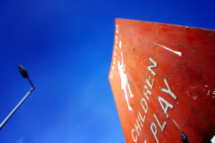
Children at play
Children at play A sign in Fermoy, Co. Cork warns motorists to watch out for kids playing on the road. I’ve seen so many people speed through built up areas these signs mean absolutely nothing to them. Technique: 1. Original image was flat and plain. Background sky was monotonous so I ran it through auto-levels…
Simple steps to photo touch-up
In this post I’m going to show you how to go post-process this image: By the end, we’ll have an image that looks like this: This tutorial was created using the GIMP, but it’s equally applicable to your favourite editing software as long as it has the same tools. Photoshop, and other editing software should…